I am commuting almost every day. That’s the fastest way to go to my office and every place. I live at suburban place, where properties and many things are more cheaper than in big city.
A month ago I downloaded KRL Access Apps, an official apps from KAI. Actually we, as passenger, are not really need this apps since commuter location already placed on each line in every station. But with the schedule mess lately, especially after Ied holiday, I thought I need to download it.
Search from Google Play, KRL Access, then download it.
First impression, well, this apps have no fun. Very rigid. As if seeing an apps made by random people, not by official institution.
Many boxes. Many grids. Use free symbol. I feel like seeing my school uniform.
Let’s see inside the menu. Click Train Position, then choose your station, you can search it too for a faster way. Then how can we read this ‘data’?
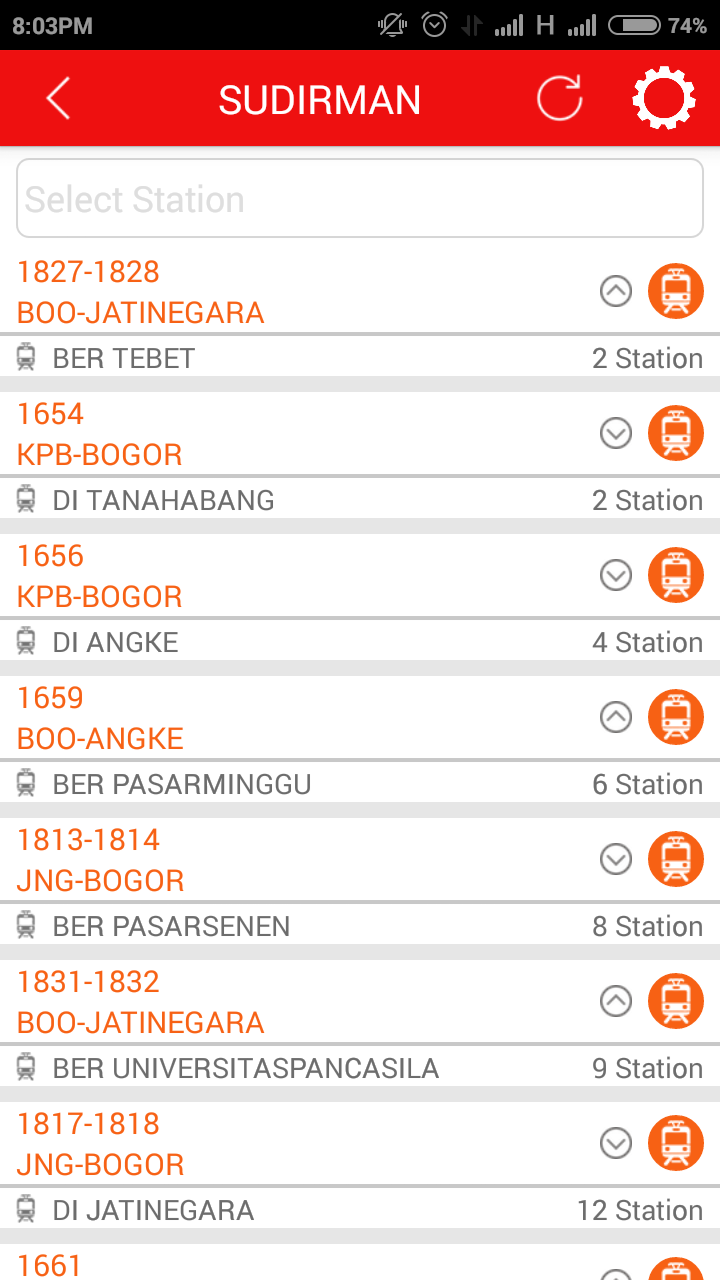
Example you choose Sudirman station, a list of commuter will show up. The first one is the nearest train from Sudirman station, and the last is the farthest commuter. What about the symbol like up and down button on the right, before train symbol? It can not be clicked. It’s just tell you that how many stations the commuter must pass to arrive to your station. Up symbol is for commuter to Jatinegara and down symbol is for commuter to Bogor. In image above, the first row, tell us that commuter to Jatinegara, will have to pass 2 more stations to arrive at Sudirman station.
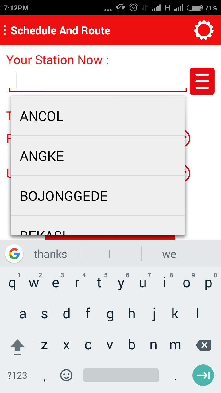
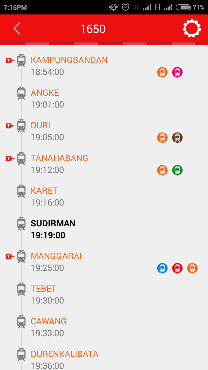
If you want to know about the schedule, choose Schedule and Route menu. Type your station or choose from the ‘paper’ symbol in upper left. Then click Show button.
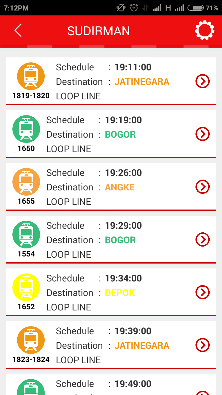
You will see list of commuter schedule and position on your station. You can click one from the list to show the commuter journey and time arrive.
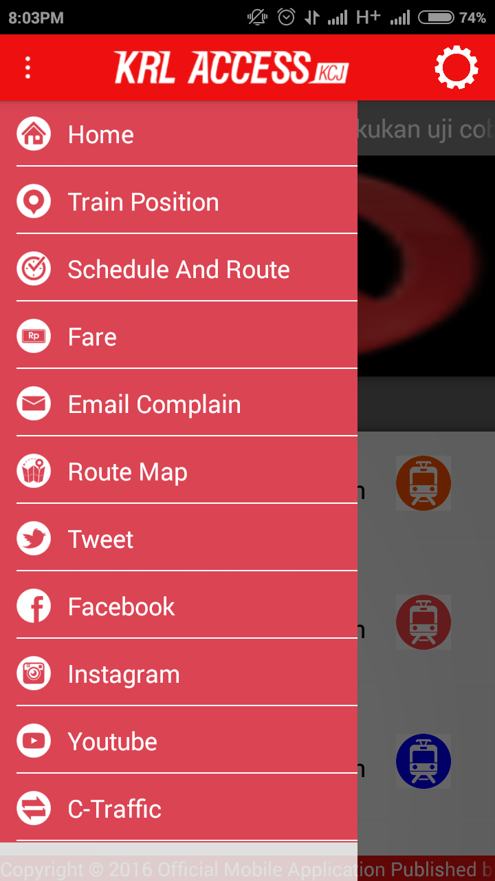
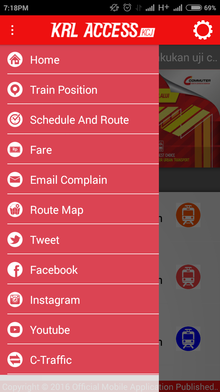
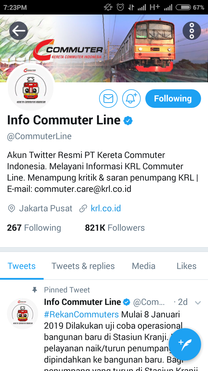
Only two menus above I use every day. Others like Fare, Email Complain, Route Map, etc, I never opened because I don’t really need it. For the Fare, I already know since I used to commute everyday. Route Map is shown inside every commuter too. And social media, I already follow official twitter long time ago. For email complain, I don’t know if it’s working, if you want to complain, use twitter instead of this apps. The official twitter act like customer service. I don’t see anything when choose C-Traffic menu.
In my opinion, this apps should be revamped. With more up to date design. Not like using template design and font. Maybe a warning box should be shown when the commuter is late or trouble occurred. As function, it’s already good. But maybe some symbols could be clicked, especially up and down symbols, or put tiny box with information if those symbols are clicked, so user can know the meaning.
I don’t see any advertisement on apps. Which is good. Keep doing it. 😊
But overall it’s only my opinion, what about yours?

Leave a comment